
User experience is the key to user engagement that leads to
conversion. This is a cycle that all online channels such as e-commerce websites,
general websites or social media channels follow. Recently I came across a
website that nearly killed my user experience and forced me to write this blog.
The Economic Times is a leading business newspaper from one of
the largest media houses in India. Their mother website http://www.indiatimes.com/ currently
ranks 142 on Alexa. Business section of this site is http://economictimes.indiatimes.com/
and 20% of the overall visitors visit this section. Looking at the prestigious
brand online and offline, I can’t believe that they are making a mockery of
user experience. I am analyzing The Economic
Times (ET) website from a product manager point of view and will analyze only
the top section of homepage.
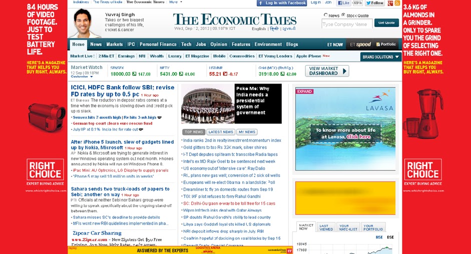
Below is the snapshot of this site’s home page on September
12, 2012. I searched for the site on Google
and as soon as clicked on ET website link, a pop up appeared on my browser
showing a Shaadi.com ad. Not only this was annoying, I could not even see the
content as pop up was covering almost 40% of the page. Anyways I avoided the
pop-up and started looking at the content. It took me few more seconds to
understand where to start as ET website has a very complex layout with no clear
focus on what is important for visitors. They use blue, black, white and red
font colors that reduce the readability of the site. If you notice, within “Top
News” section they use normal blue, bold blue, normal red and bold red fonts
for no obvious reason. If something is really important for visitors then they could
have made it bold but use of two colors and bold fonts is awkward. To make
things ever worse, top news has black background and white font which does not
go with the color theme of the site.
(You can click on the images below and see how cluttered the site is)

ET’s user experience horror story does not end here. Site’s
background shows an ad and although it makes site look like a B grade Bollywood
movie poster, it is not as bad as the pop up. Site’s homepage has two prominent
ads on right hand side and one on bottom of the page. I can live with one or
two ads but having three is just too much. Moreover these ad units are dynamic
in nature and play different animations simultaneously that distracts a lot while
reading text on this site. Worst piece of advertising is Google ads on this
site. If you notice on the left hand bottom they display a Google ad (In this
case Zip Car Sharing) that has same font color and size as any other text on
site. For a normal user it will be very difficult to find a difference between
Google Ad unit and content.
Clicking on any of these links will show you articles that are
even more poorly designed and served. Overdose of social channels’ icons and ads
causes a very poor engagement and user experience. I understand websites make
money by displaying ads and so does ET. However, the aim of product owner
should be providing best user experience and adjust the ads so that users can
have a seamless experience. I wish The Economic Times site owner reads this blog and
makes few changes resulting in better user experience.